Forum Replies Created
-
AuthorPosts
-
February 9, 2016 at 11:11 pm in reply to: Ambience pro : Change post title color in homepage grid #178709
Tom
ParticipantHi Dimitris,
For your text colours, use this CSS in your child theme stylesheet, placing it just before the media queries.
.ambiance-grid .entry-title a {
	color: blue;
}

.ambiance-grid .entry-title a:hover {
	color: lime;
}

.ambiance-grid .entry-meta  {
	color: black;
}
For the menu, see this post.
https://www.studiopress.community/topic/nav-menu-ambiance-pro/#post-158333
Choose your next site design from over 350 Genesis themes.
[ Follow me: Twitter ] [ Follow Themes: Twitter ] [ My Favourite Webhost ]ParticipantMove this media query 100% width snippet from the 1024px setup to something more appropriate for your site, or create a new specific rule for this section:
.flexible-widgets.widget-fourths .widget, .flexible-widgets.widget-halves .widget, .flexible-widgets.widget-thirds .widget {
    float: none;
    width: 100%;
}
Choose your next site design from over 350 Genesis themes.
[ Follow me: Twitter ] [ Follow Themes: Twitter ] [ My Favourite Webhost ]ParticipantHi,
Altitude Pro uses "flexible widgets": different counts of widgets are styled like this.You'll need to override those styles, starting with something like this:
.front-page-2 .flexible-widgets.widget-area .widget {
	width: 50%;
}
Choose your next site design from over 350 Genesis themes.
[ Follow me: Twitter ] [ Follow Themes: Twitter ] [ My Favourite Webhost ]ParticipantHi,
Find this code in your stylesheet inside the 800px media query; delete or disable it to keep nav-primary pinned to top-of-page.
.nav-primary.fixed {
    position: relative;
}
Choose your next site design from over 350 Genesis themes.
[ Follow me: Twitter ] [ Follow Themes: Twitter ] [ My Favourite Webhost ]February 9, 2016 at 12:27 pm in reply to: Altitude pro front page widget area 2 with 3 responsive images #178673ParticipantHi,
It appears that you've clobbered the theme styling lines 1219-1304. You can fix this with the following CSS, adding your max-height rule at the bottom. (an FYI, your overall idea may not look as intended on shorter screens).front-page-1 { background-attachment: fixed; background-color: #fff; background-position: 50% 0; background-repeat: no-repeat; -webkit-background-size: cover; -moz-background-size: cover; background-size: cover; max-height: 550px; }Add this for your FP-2 images:
.front-page-2 .widget-area .wrap {
	max-width: 100%;
	padding: 0px;
	margin:  0px;
	border:  none;
}

.front-page-2 img {
	width: 100%;
}
Add this for appearance on mobile:
@media only screen and (max-width: 640px) {

.front-page-2 .one-third  {
	clear: both !important;
	width:  100%;
	line-height: .6;
}
Adjust as necessary.
(Skip any links embedded in these snippets, they're being added by the forum, not me!)
Choose your next site design from over 350 Genesis themes.
[ Follow me: Twitter ] [ Follow Themes: Twitter ] [ My Favourite Webhost ]ParticipantHi Susan,
Some testing here:
<?php echo 'Hello World'; ?>
<h1>Hello World</h1>
#id .class {
    display: block;
    float: left;
}
The above samples are copied from the cited FAQ section 5, but do not work unless also wrapped in backticks as this CSS sample shows (, Use of backticks is not documented in the FAQ:
#id .class { display: block; float: left; }Plain Text wrapped in code backticks<< using the "code" button in the editorEach of these "backticked" samples is barely legible. It seems obvious that both the FAQ and the forum styling fall short for sharing code snippets outside of Gists. Sharing snippets this way is likely to be problematic.
Choose your next site design from over 350 Genesis themes.
[ Follow me: Twitter ] [ Follow Themes: Twitter ] [ My Favourite Webhost ]ParticipantI've been using Stylebot to adjust for this. Also for the too-wide (IMO) presentation of posts and replies with the new wider site.
Choose your next site design from over 350 Genesis themes.
[ Follow me: Twitter ] [ Follow Themes: Twitter ] [ My Favourite Webhost ]ParticipantHi Jon,
You must have been asleep when you thought this up. 🙂 Very interesting concept with commercial potential.
(There goes my afternoon ... )
Choose your next site design from over 350 Genesis themes.
[ Follow me: Twitter ] [ Follow Themes: Twitter ] [ My Favourite Webhost ]ParticipantI dropped a note to StudioPress about the Safari weirdness. We'll see what's up officially before long so we don't have to do this each time. 🙂
Choose your next site design from over 350 Genesis themes.
[ Follow me: Twitter ] [ Follow Themes: Twitter ] [ My Favourite Webhost ]ParticipantThere are several ways to change this. Using CSS in your child theme stylesheet.
For this page, this form:
.post-2610 form table {width: 205px;}
Choose your next site design from over 350 Genesis themes.
[ Follow me: Twitter ] [ Follow Themes: Twitter ] [ My Favourite Webhost ]ParticipantIt's not like StudioPress to miss something on 1st release. You can overcome this by finding the CSS below in your child theme stylesheet, then editing width from 35% to 34.5%.
.footer-widgets-3 {
    padding-left: 0;
    text-align: left;
    width: 35%;
}
Choose your next site design from over 350 Genesis themes.
[ Follow me: Twitter ] [ Follow Themes: Twitter ] [ My Favourite Webhost ]ParticipantHi Scott,
You'll have to be comfortable with editing a bit of CSS, or choosing a design-helper plugin like Design Palette Pro (of course, check your needs against their capabilities). And you'll need to define what you want to do with each section. The following CSS produces the result in the attached image. This styles only front-page-1, so you could do something different if necessary for another section.
#front-page-1 .widget_text {
	background: rgba(255,255,255,.5);
	color: #114511;
	padding: 20px;
	border-radius: 10px;
}

#front-page-1 .button.clear {
    border-color: #114511;
    color: #114511;
}

#front-page-1 h2 {
	font-weight: 700;
}
https://cloudup.com/cg5TRx0Yt2z
Choose your next site design from over 350 Genesis themes.
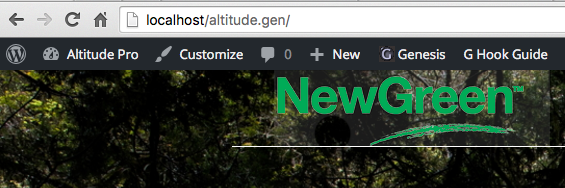
[ Follow me: Twitter ] [ Follow Themes: Twitter ] [ My Favourite Webhost ]ParticipantHi,
Your logo is not quite transparent.
This is Altitude showing your logo with a round chunk taken out of the transparent background just beneath the "e" + "w".
Choose your next site design from over 350 Genesis themes.
[ Follow me: Twitter ] [ Follow Themes: Twitter ] [ My Favourite Webhost ]February 2, 2016 at 6:59 pm in reply to: featured post widget on homepage is very different format than category page #178206ParticipantThere can't really be consistency when front page designs are, of course, quite different from theme to theme. The altitude theme does not include a presentation of featured posts on the front page, like say, News Pro, where there are four different FP styles presented in the demo - none of which resemble the blog feed.
Because you've specified a featured image to appear to the left, the default browser behaviour alone will push the content and title to the right, getting it out of the way. The default theme styling also leaves the text centered, etc.
Can you describe in some detail what you want? How should featured posts appear in Home-5 on your site? (meta, image size & placement, content, post-info, typeface details, sizes, alignments, etc.?)
Choose your next site design from over 350 Genesis themes.
[ Follow me: Twitter ] [ Follow Themes: Twitter ] [ My Favourite Webhost ]February 2, 2016 at 6:20 pm in reply to: featured post widget on homepage is very different format than category page #178201ParticipantI would expect these to behave similarly.
I'm curious about why you expect this. The pre-sale/demo presentation and theme setup guide don't display featured posts at all.
To obtain the blog appearance on the home page, remove all content from the home page widgets.
If you can describe the widgetized appearance you want in detail, provide an example, etc., you may be able to get help more directly.
Choose your next site design from over 350 Genesis themes.
[ Follow me: Twitter ] [ Follow Themes: Twitter ] [ My Favourite Webhost ]ParticipantBecause you've changed the menu text/background style for desktop views, you have to follow those colour changes through the media queries, too, to make the menu items visible. (they're there, just white-on-white).
Choose your next site design from over 350 Genesis themes.
[ Follow me: Twitter ] [ Follow Themes: Twitter ] [ My Favourite Webhost ]January 27, 2016 at 6:08 pm in reply to: Lifestyle Pro – Secondary Navigation Menu disappears #177700ParticipantHi @stevebhq
You've reached a common limit for the number of WordPress menu items. Please see more here:
https://wordpress.org/support/topic/menu-size-limitSolutions on that page may involve adjusting server settings via your webhost. You can also evaluate using another method to build your menus other than the default WordPress menu editor. Best first step is to reassess your information presentation and menu structure(s).
The UberMenu plugin (may be uberkill for your needs) can handle much larger numbers of menu items plus a whole lot more. It gives you many more options for organizing and automating your information. The main menu on the site linked in the footer below is built with UberMenu and other plugins using zero maintenance when adding posts with structured categories. (other than rare plugin updates). Item count is user choice.
The menu on this site is built with a smaller overall menu item count but more complex categorization. Four menu levels, again driven by categories, again zero maintenance to make new categorized posts land properly in the menu structure. Using the Add Descendants As Submenu Items plugin:
https://wordpress.org/plugins/add-descendants-as-submenu-items/
Choose your next site design from over 350 Genesis themes.
[ Follow me: Twitter ] [ Follow Themes: Twitter ] [ My Favourite Webhost ]ParticipantThis is to make sure that content shown in front, always has background at the back to fill the area behind.
For others following, if
background-size: contain;is used, some of the content you may have intended to appear in the foreground may disappear offscreen from 1140px and down. Using 'contain' puts an emphasis on the dimensions of the image, not the content from home-section-1 contained in the same div.
Choose your next site design from over 350 Genesis themes.
[ Follow me: Twitter ] [ Follow Themes: Twitter ] [ My Favourite Webhost ]January 19, 2016 at 3:44 pm in reply to: Altitude pro – jumping instead of scrolling in device portrait orientation #176964ParticipantIt's sorta just you? 🙂
I do see some of this on my android tablet (portrait), on some of the page scrolling but not all. I don't see a trace of it on my iPhone 6.
I did wonder if it was the page pausing while the images download, but it happens after they're complete, and in portrait only.
Hmmm.
Choose your next site design from over 350 Genesis themes.
[ Follow me: Twitter ] [ Follow Themes: Twitter ] [ My Favourite Webhost ]ParticipantYou're welcome!
Choose your next site design from over 350 Genesis themes.
[ Follow me: Twitter ] [ Follow Themes: Twitter ] [ My Favourite Webhost ] -
AuthorPosts