Forum Replies Created
-
AuthorPosts
-
November 4, 2015 at 5:21 pm in reply to: Genesis Corporate Theme – Is it Responsive? Where is it? #170182
carasmo
ParticipantParticipantIn your admin, navigated to Appearance then Editor and on the far right of the window there will be style.css
Open that, scroll all the way down to the very end:
Insert this css:
#nav li ul ul {
	margin: -33px 0 0 138px;
}
Save it. Clear your browser cache.
November 4, 2015 at 8:07 am in reply to: Theme demo site with feature for switching device size types #170136ParticipantGoogle "wordpress theme switcher bar" w/o quotes:
http://codecanyon.net/item/fbar-responsive-wordpress-demo-switch-bar-plugin/5117122
ParticipantThe header is nice and balanced now, if you swap them it will be off balance, you can take a screen shot and move stuff around in Photoshop to see what I mean. Plus you can't really move over the logo between the widgets without going into the functions.php file and do a lot of re-working as far as I can think of, such as unregistering widgets, adding custom widgets, moving the site title hook at a different priority -- yeah really beyond the scope of help on the forum.
Participant.home-top-left.widget-area.three-fourths.first, .home-top-right.widget-area.one-fourth { background:#fff; padding:20px; margin-top:30px; border:1px solid #eee; }Same style.css put it last but not inside the media query.
You created these divs and the classes are used for styling. Get some developer tools and a good CSS tutorial (TeamTreehouse has videos!) if you continue to do this type of work. You should be able to charge for outside help, like pad each estimate with an extra few hundred dollars to use towards help or pro plugins like drag and drop (like beaver builder) and so forth. That will help you rock.
ParticipantWhat is the other thing? If I know the answer, I'll share it. I'm very new to WordPress but my CSS skills, when I'm not tired, are very, very good.
ParticipantYes, now it is in the CSS.
Now it's added, I made an error in the class specification, this new code below will work:
See image:

@media (max-width:600px) {
   .site-header .widget-area #text-8.widget,
   .site-header .widget-area #text-5.widget {
	display:block;
	float:none;
	padding-left:0;
	padding-right:0;
	margin-left:auto;
	margin-right:auto;
   }
}
November 3, 2015 at 4:44 pm in reply to: Featured Page Widget – Move featured image below content on mobile – CENTRIC Pro #170088ParticipantA rule of thumb: first in content first in mobile view unless you use flexbox box model or jquery to reorder things on different viewports. The widget itself puts the image first. I totally think this should be an option.
You can use flexbox and just know that IE8 needs fallback styles. There are lessons all over the place on flexbox. https://nostrongbeliefs.com/flexbox-vertical-ordering/
If you are good with jQuery and CSS you can clone the image after the content and hide the original and then show it again when the size reaches the breakpoint you choose. There may be examples on StackOverlow.
If you're good with php, you can fork the original widget, rename it and the instances (you'll have to learn how to fork something) and then move the image (line 130) below the the title and text (line 212). Then float at the break point and remove the float on the small viewport. There are hooks, so forking may not be necessary.
It's pretty involved.
ParticipantParticipantI see it. Have you shared the page in the past. Right now the facebook dev tools are slow or not working.
Participantthis part
/wp-content/uploads/2015/10/fb.jpgWhen you load an image in the media library, click on it and in the left it will give you the full path, you don't need the entire path just the one relative to the root because get_site_url does the first part for you.
November 3, 2015 at 1:53 pm in reply to: New Custom Website first time w/Genesis and WP (well kinda) #170066ParticipantThanks on the feedback.
I didn't realize that when I put the (function($) { ... } })(jQuery); that that wasn't equivalent to
$(function()) { ... });and so when it worked as expected on desktop and chrome spoofing and it didn't work on touch (not any of them) I was at a loss to figure it out. Once I added the correct functions to tell the browser what to do, then I realized that I was an idiot. Temporarily.
ParticipantYoast gives you the ability assign an image even if you have no image in the post, that's what I Iike about it. I wish it had the ability to have a fallback image -- I wrote one for another CMS I use and it works great, if there is an image then show it if not show this one...having a hard time translating some of my skills on WordPress.
I know how to add a fallback image that will take over any Yoast settings -- whether it's loaded before or after in the priority (below is 15 - after, but when it's 5 [before] it still does the same thing). I see both on the scrape but only the fallback posts and that's not what I want. In your case, if you don't have an image for most of your posts, you can add one for at least Facebook and Pinterest -- they both use og.
https://developers.pinterest.com/docs/rich-pins/articles/
goes in functions.php
/**
============================================================
- THEME HEAD : Facebook/Pinterest image change the path to yours
============================================================*/
add_action( 'genesis_meta', 'cab_facebook_fallback', 15 );
function cab_facebook_fallback() {
	echo '<meta property="og:image" content="'.get_site_url().'/wp-content/uploads/2015/10/fb.jpg" />';
}
ParticipantParticipant1. There's only one style sheet you need to add your css to:
wp-content/themes/yourchildthemename/style.css
OR go to Editor in your Admin and select style.css
Make a copy of the text in a plain text editor before you begin.

You add the media query last in one location only. Scroll all the way down, after the last curly bracket -- after it, not inside -- paste this in and save the file:
@media (max-width:600px) {
   .site-header .widget-area .widget-area #text-8.widget,
   .site-header .widget-area .widget-area #text-5.widget {
       display:block;
       float:none;
       padding-left:0;
       padding-right:0;
       margin-left:auto;
       margin-right:auto;
    }
}
Clear your caching plugin. Every time I've checked the file for this CSS, it's not there. Until it's added AFTER all others with the same class then you won't see any changes. If a site is cached either by a caching program or on an individual's browser, all changes won't be visible. Instruct your client to clear cache after you have added the CSS last.
No one will see changes unless you:
Save the style sheet
Clear the browser cache -- that is everyone whose visited the site
Clear your caching in any caching plugin.
ParticipantThis theme is using using js to make the page height the window height:
The code is in the home.js on lines 14-25 = wp-content/themes/altitude-pro/js/home.js
All sections will be affected if you change this. It has nothing to do with padding or margin. Below is the js and I've added comments so you can understand
	// Image Section Height
	var windowHeight = $( window ).height();
        // --> get the window height on doc ready

	$( '.image-section' ) .css({'height': windowHeight +'px'});
        // ---> Make this class the height of the viewport on doc ready

	$( window ).resize(function(){

		var windowHeight = $( window ).height();

		$( '.image-section' ) .css({'height': windowHeight +'px'});
                // ---> Make this class the height of the viewport on resize

	});
These are the affected areas WITHOUT js.


Comment out the lines 14-25 and you will get shorter areas everywhere. Unless you go in to assign different classes and change / re-write the js for only specific classes or ids.
ParticipantDig it! Nice they match your design!
Now, I am using the Yoast SEO plugin (free) because it's better and more updated than Genesis, plus I can specify an image (even one that's not being used) and I can change the text that shows up on the networks, if I want.
When you use Yoast, Genesis will turn off their SEO, and you'll see new stuff, one of them is the Social tab, this is very key.
These are private posts.


You can test open graph https://developers.facebook.com/tools/debug/
1. Load Yoast
https://developers.facebook.com/docs/sharing/best-practices#images
https://developers.facebook.com/docs/sharing/best-practices
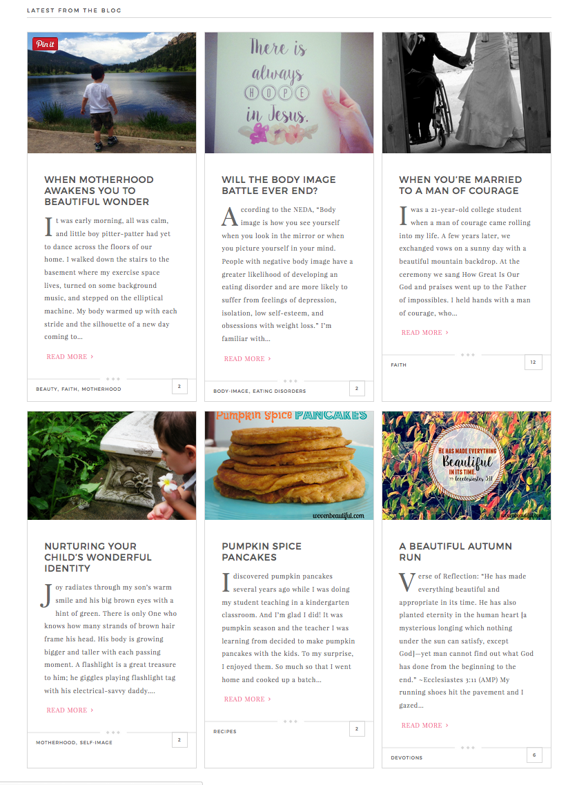
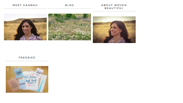
ParticipantNovember 2, 2015 at 2:00 pm in reply to: Blog Posts Excerpts on Home Displaying Uneven Darling Theme #169921ParticipantThe latest posts area looks even on the top row and even though the height of the images on the bottom row are not the same as the top row, they look nice as well. They are lining up.
On tablet size, the about section boxes are not lining up. That's because floats need exact heights and the text About Woven Beautiful is too long and shifts on two lines. Make it shorter.
ParticipantI'm sorry you're having a difficult time.
I can't actually do it for you, you may want to hire someone. There's Brad at http://wpsites.net/contact/ -- he rocks! He will need your ftp information. Don't share it on the forum.
But before you go that route:
Are you working on the child theme? That is the style sheet you need to edit.yourdomain.com/wp-content/themes/enterprise-pro/style.css
Make a copy on your local hard drive with the date and time and then you have a backup.
Clear your cache in your cache plugin (see your plugins in the wp-admin and read their instructions).
-
AuthorPosts