• Skip to main content
  • Skip to forum navigation

StudioPress

  • Shop for Themes
  • My StudioPress

Forum navigation

  • Home
  • General Genesis Discussions
  • StudioPress Themes
  • Genesis Blocks
    • Genesis Blocks
    • Genesis Custom Blocks
  • Retired Themes
  • FAQs
  • Forum Rules
  • Internationalization and Translations
  • Forum Bugs and Suggestions
  • Forum Log In

Are You Using The WordPress Block Editor?

Genesis now offers plugins that help you build better sites faster with the WordPress block editor (Gutenberg). Try the feature-rich free versions of each plugin for yourself!

Genesis Blocks Genesis Custom Blocks

Content/Sidebar/Sidebar for Decor8ted Theme on Horizontal iPad view is broken

Welcome!

These forums are for general discussion on WordPress and Genesis. Official support for StudioPress themes is offered exclusively at My StudioPress. Responses in this forum are not guaranteed. Please note that this forum will require a new username, separate from the one used for My.StudioPress.

Log In
Register Lost Password

Community Forums › Forums › Archived Forums › Design Tips and Tricks › Content/Sidebar/Sidebar for Decor8ted Theme on Horizontal iPad view is broken

This topic is: resolved

Tagged: Decor8ted, iPad, responsive

  • This topic has 1 reply, 2 voices, and was last updated 11 years, 10 months ago by thepixelista.
Viewing 2 posts - 1 through 2 (of 2 total)
  • Author
    Posts
  • September 4, 2013 at 1:13 pm #60697
    Jami Howard Mays
    Member

    I've put in a support ticket to The Pixelista, but wanted to see if anyone else was having issues.

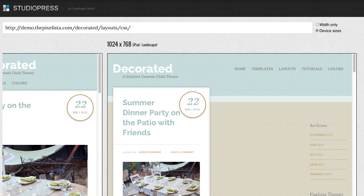
    When you choose the three-column layouts, the responsive code for a horizontal ipad layout is broken.

    Sidebar/Sidebar/Content
    Sidebar/Content/Sidebar
    Content/Sidebar/Sidebar

    Decor8ted Theme Horizontal iPad responsive layout is broken

    You can see the big space to the right of the content area where the primary sidebar ought to be, but it's actually down at the bottom of the entire blog feed. There's an issue with the widths, but I can't figure out what it is exactly.

    I figured I'd post it here to see if anybody else knew. When I hear back from The Pixelista, I'll update this post with the specifics.

    The initial response from The Pixelista instructed me to add this code to the bottom of the stylesheet and it had no effect:

    @media only screen and (max-width: 1200px) {
    .content-sidebar-sidebar .content { width: 400px; }
    .content-sidebar-sidebar .content-sidebar-wrap { width: 790px; }

    Jami Howard Mays, HBIC, Imaj Works | Athens, Georgia

    September 4, 2013 at 9:48 pm #60764
    thepixelista
    Member

    Hi Jami, thanks for reporting this bug! I've released a new version of Decorated (now 2.0.1) available in your My StudioPress dashboard that includes the fix.


    My passion is working with women to create beautiful and functional websites that allow their personalities to shine through! Visit my website: http://thepixelista.com/

  • Author
    Posts
Viewing 2 posts - 1 through 2 (of 2 total)
  • The topic ‘Content/Sidebar/Sidebar for Decor8ted Theme on Horizontal iPad view is broken’ is closed to new replies.
CTA

Ready to get started? Create a site or shop for themes.

Create a site with WP EngineShop for Themes

Footer

StudioPress

© 2025 WPEngine, Inc.

Products
  • Create a Site with WP Engine
  • Shop for Themes
  • Theme Features
  • Get Started
  • Showcase
Company
  • Brand Assets
  • Terms of Service
  • Accptable Usse Policy
  • Privacy Policy
  • Refund Policy
  • Contact Us
Community
  • Find Developers
  • Forums
  • Facebook Group
  • #GenesisWP
  • Showcase
Resources
  • StudioPress Blog
  • Help & Documentation
  • FAQs
  • Code Snippets
  • Affiliates
Connect
  • StudioPress Live
  • StudioPress FM
  • Facebook
  • Twitter
  • Dribbble