Community Forums › Forums › Archived Forums › General Discussion › Altitude Pro issue
- This topic has 13 replies, 4 voices, and was last updated 10 years, 7 months ago by
Porter.
-
AuthorPosts
-
November 11, 2015 at 4:59 pm #170804
carolacat
MemberHi,
I am working on Altitude Pro theme on http://www.moyglarelodge.com (I cannot publish the page at the moment. My question is how do I get the genesis slider to display in the same way as http://pamkelley.com/ so that it fits the full page. At the moment on my site it's displaying as a box on top of the page, not as the page itself. I think I may have to do something with the padding???
Can anyone advise please?
Much appreciated.
http://www.moyglarelodge.comNovember 11, 2015 at 8:52 pm #170811Porter
ParticipantIt's really hard to say without seeing the site. You could use hooks to remove it, then add it to the top of the page. It's likely within the "content" div, where as you'll want to put it somewhere with width: 100%. If there's any way you can get the site running, staging or live, that would help me help you.
November 11, 2015 at 8:53 pm #170812Victor Font
ModeratorPam Kelly's site is not using the Genesis Slider. That site uses the Soliloquy slider. Soliloquy has a full screen option. https://soliloquywp.com/
Regards,
Victor
https://victorfont.com/
Call us toll free: 844-VIC-FONT (842-3668)
Have you requested your free website audit yet?November 20, 2015 at 3:43 pm #171674MemberThanks Victor,
I have installed this soliloquy slider but there seems to be padding on the both sides of the site. Any reason that you or anyone else can see for this? I want the header and the slider to wrap to full width. Been fiddling for hours now!
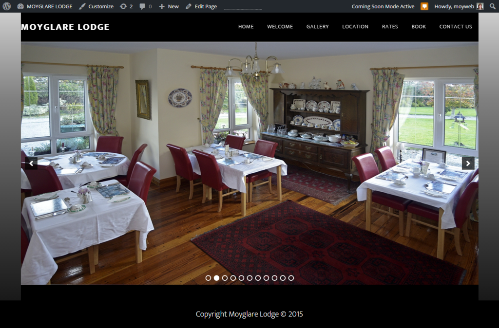
Again the site isn't published so you can't see it live but there is a screen shot
Any ideas appreciated!
November 20, 2015 at 3:51 pm #171675ParticipantWas the header full width before you installed the plugin? Looking at the demo page for Altitude Pro, it's full width by default, so I'm not sure why it isn't for you if that's the desired feel. It's quite hard to troubleshoot without access to the page, as this would let us inspect the CSS. Are you familiar with using the browser inspector to view elements and their CSS? My guess is that either the slider is adding some sort of padding, or your content or site-inner sections have something going on with them (padding, margin, or improper width). I can't speculate much more beyond that without seeing what's going on live.
November 20, 2015 at 3:57 pm #171676MemberThis reply has been marked as private.November 20, 2015 at 3:58 pm #171677MemberJust sent a private reply to you but as you are a participant, I'm unsure if you can see it, Porter?
November 20, 2015 at 4:00 pm #171678ParticipantI cannot, but you can email me at Gemfruit at Gmail.com and I can check when I'm home in 20.
November 23, 2015 at 10:34 pm #171891clendanielc
MemberI don't know if I should post a seperate post or not as Im having the same issue. Ive been trying for hours figuring out where the padding is coming from. I can offer my site as a guinea pig if that would help:
November 23, 2015 at 11:03 pm #171892ParticipantNo problem, literally the same exact issue.
In style.css, locate:
.site-inner, .wrap {
    float: none;
    margin: 0 auto;
    max-width: 1200px;
}
Change it to:
.site-inner, .wrap {
    float: none;
    margin: 0 auto;
    max-width: 100%;
}
If you want to only have this effect on the home page (not full screen everywhere else, for whatever reason), add something like:
.home .site-inner, .wrap {
    float: none;
    margin: 0 auto;
    max-width: 100%;
}
November 24, 2015 at 10:34 pm #171969MemberThank You! Thank You! That worked. I hate to bug you again but, how would I tackle the height? Ive been working on getting the height of the slider to full but can't seem to find where to change that. If you could help me, I owe you two beers.
Thanks again!
November 25, 2015 at 8:26 am #171996ParticipantWhat exactly is your end goal? Given the resolution of the photos you're using, your width is larger than your height (standard), so you can't have 100% width AND 100% height, as your images don't scale to the 1920x1080 resolution (or varying aspect ratios for that matter). You can do 100% width no matter what, and set a min-height (700px for example), which will give you consistent results, but you'll lose a decent portion of each photo on the slider (it'll get cut off).
Another thing I found is this, which you can try out - https://soliloquywp.com/docs/preserve-full-image-width-height/
I'm not sure what the end result is there, but it may be of help, so give it a try.
December 2, 2015 at 8:19 am #172425MemberSorry for the very late reply. Still recovering from the holidays. My main goal is not so much increasing the height but to either remove all padding around the widget or somehow make it just the widget for freatured page 1. The resolution on the photos are the same resolutions as ones Ive seen on similar sites using the same plugin. They have the slideshow full screen with the menu transparent. Ive tried to deconstruct similar sites to figure out how they were able to do it. So far, Im at a loss. Then again, I could be overlooking it without realizing it.
Thanks for your help so far. Appreciate it!
December 2, 2015 at 8:54 am #172427ParticipantDo you mean the grey area between the navigation and the images? That's set from:
.flexible-widgets {
    padding-bottom: 60px;
    padding-top: 100px;
}
You should be able to override those values (they're probably set from a plugin) by adding !important, or you could add another selector to make it more specific, like .front-page-1 .flexible-widgets. I played with it a bit, and setting the value as 77px seems to be your best bet. There's one issue though, since your vertical navigation size is variable (it alters as you scroll down a bit), you can't have a one size fits all solution, so you lose 50~ pixels at the top of your image when the menu does become smaller. or if you match that size, you have a bit of grey when it's small, and none when its big.
Alternatively, you could change the grey gradient background (grey above image, black below image) to just be the same black as your header, which looks pretty nice:
.image-section {
background-color: #000;
}
Again, add !important, or another selector, like .front-page-1 if need be.
As for making the slider your entire page (I assume navigation and footer included, but nothing else), that's certainly possible too, but would require slightly more work.
-
AuthorPosts
- The forum ‘General Discussion’ is closed to new topics and replies.