Community Forums › Forums › Archived Forums › General Discussion › THE 411 PRO – REPLACE DESKTOP MENU WITH HAMBURGER
Tagged: hamburger, hamburger menu, menu, responsive, the 411 pro
- This topic has 10 replies, 3 voices, and was last updated 8 years, 10 months ago by
Christoph.
-
AuthorPosts
-
June 13, 2015 at 10:25 pm #156146
Webmaster
MemberGreetings - I have a situation where I am using the THE 411 PRO theme and have several menu items. And while the demo looks great with just three menu items, add a few more and it looks like Hell. So, I'm thinking the best idea is to simply place a hamburger menu over on the right side of the sticky header (where the traditional menu is in the demo). In this way I can just introduce the the menu under the hamburger - which will be identical to the responsive behavior.
The problem is, I can't seem to figure out the needed modification. When I thought I had it, it was only a box you couldn't see except in hover. And, it was detached from the sub-menu so the sub-menu would disappear when you tried to select a sub-menu item. So now it's just on my nerves. Has anyone by chance worked on this?
If not, one of you developers give me a price for modifying the style.css (which has no other modifications).
Thanks in advance.
“If it works, mark the post as [Resolved] so others will feel comfortable trying the solution on their website.“
June 14, 2015 at 1:26 am #156156Brad Dalton
ParticipantThis solution produces exactly what you see in the screenshot http://wpsites.net/wordpress-themes/using-mobile-hamburger-menu-on-desktops-eleven40-pro/

Or
You could use this solution http://wpsites.net/web-design/click-menu-icon-to-display-menu-in-any-genesis-nav-menu/
June 14, 2015 at 1:20 pm #156186MemberHi Brad,
Thanks for the options. The one option looks like it simply adjusts the media query to reflect the mobile menu on the larger viewpoints. For the desktop, I was really trying to just keep the hamburger in the header - replacing the traditional menu exactly where it sits (on the right). People already get irritated with the hamburger being on a separate row on their mobile devices; I don't want to try to introduce it on a separate row in the desktop too.
Another thing is that it needs to work the same way it does on a mobile (sort of). What I mean is that the main menu items should appear under the hamburger when it is clicked. At that point it looks like what would be the sub-menu of a traditional menu item...
As an example, I initially accomplished this by simply creating a menu with one "main" menu item named "Menu". Then I used a hamburger image for that solitary menu item. Next, I created all of my links as "sub-menu" items of that main "Menu" item. And actually, it worked great - that is, until it went to mobile and there was a hamburger inside of a hamburger!
After seeing the intro pages you linked to, I'm surprised I was able to get as close as I did working entirely in the css file, but I would like to get this done as I described, so I would still like to get a quote if anyone has the time to fool with it.
spider_owmxcb (AT) trashmail.com
And thanks again Brad for taking time to respond.
Regards -
“If it works, mark the post as [Resolved] so others will feel comfortable trying the solution on their website.“
June 16, 2015 at 4:01 pm #156435MemberNobody?
Well then, does anyone know how to change the menu that is displayed in the hamburger menu on mobile devices. That way I can just leave the fake hamburger on the desktop view and have the responsive view load a different menu.
Thanks in advance -
“If it works, mark the post as [Resolved] so others will feel comfortable trying the solution on their website.“
June 16, 2015 at 10:43 pm #156491Christoph
MemberJune 17, 2015 at 3:43 am #156500MemberYes, as I mentioned, I actually created something just like that using just one menu item in which I placed a hamburger image) and made all my other links a sub-menu item of the single menu item that was displayed as a graphic. The problem occurred when I pulled in the browser window to a tablet or mobile size - once it went to the responsive menu, it has its own hamburger graphic. So you would click the responsive menu hamburger and then see my graphic hamburger and only after clicking it would you see the menu of sub-menu items.
“If it works, mark the post as [Resolved] so others will feel comfortable trying the solution on their website.“
June 17, 2015 at 12:02 pm #156541MemberYou can show the hamburger menu on desktop view by increasing the width of the $(window).resize(function(){
in responsive-menu.js and by moving all the selectors for .genesis-nav-menu.responsive-menu out of the media queries.This way the work around with the hamburger symbol top menu should not be needed.
June 17, 2015 at 2:22 pm #156567MemberHey Christoph,
Thank you for the tips; I appreciate you taking the time.
And actually, increasing the width in the responsive-menu.js file was the first thing I tried, but it had no effect whatsoever. I figured it was being overwritten somewhere else, but could not locate it. Then I tried moving the file completely out of the js directory and indeed, the menu did not turn to a hamburger.
So next I checked the media queries and found that by adding a zero (changing 768 to 7068) to both the css and the js file I could get the hamburger menu to appear (though obviously it also affected the site container). Problem there, was that the hamburger was under the site-title instead of beside it. I stopped going that direction because, as I mentioned to Brad, I really wanted the menu to remain beside the site-title when the site is viewed on a desktop.
Honestly, I wouldn't even have fooled with this thing for this long, but I recently revisited this theme as a solution for mobile-ready sites for small companies with (relatively) little content. The lack of a sidebar, the dedicated areas for social icons and the "Click here" call-to-action area seemed perfect. But if the company name is any length at all, it screws up the clean look of the header. And since it is a sticky header, well, people have to stare at it the entire time.
Also, when I used the graphic for the main menu item, the sub-menu expanded way out to the right, off the site container and into the background graphic. I think it should stay over the site container, and to do that the sub-menu items would need to expand out to the left, not the right.
So getting this header/menu to look really professional would be a bit of work - work that apparently is too small and unattractive of a job. It probably should be a plugin, but anyway... thanks again.
“If it works, mark the post as [Resolved] so others will feel comfortable trying the solution on their website.“
June 17, 2015 at 2:42 pm #156573MemberHi,
sorry I didn't read the whole conversation.
I will send you an email if you are still interested in getting this fixed.
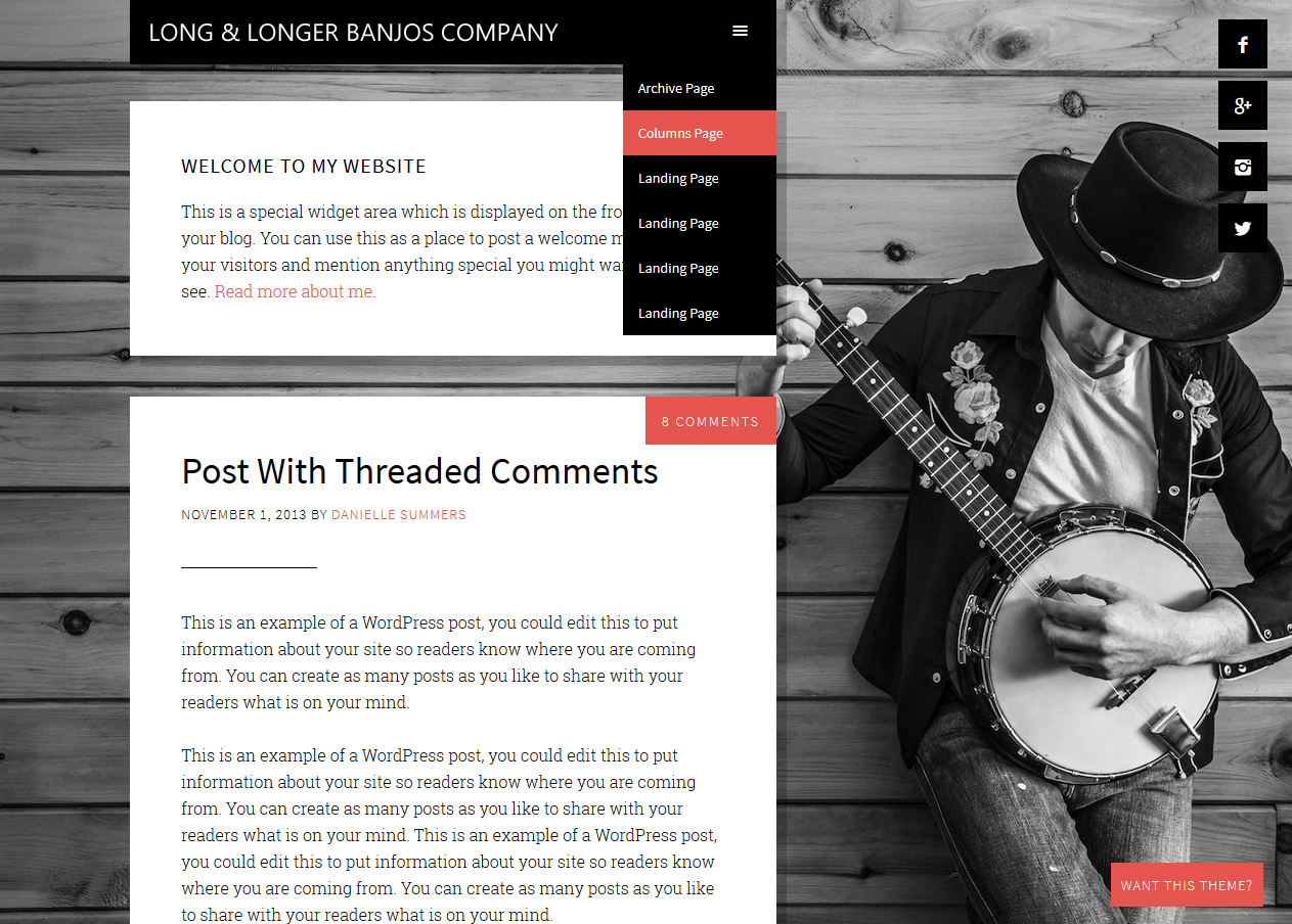
June 17, 2015 at 2:50 pm #156575MemberYes, I am... and this may help:
“If it works, mark the post as [Resolved] so others will feel comfortable trying the solution on their website.“
June 17, 2015 at 2:59 pm #156576MemberThank you for contacting me.
I´ll be in touch shortly.
-
AuthorPosts
- The forum ‘General Discussion’ is closed to new topics and replies.