• Skip to main content
  • Skip to forum navigation

StudioPress

  • Shop for Themes
  • My StudioPress

Forum navigation

  • Home
  • General Genesis Discussions
  • StudioPress Themes
  • Genesis Blocks
    • Genesis Blocks
    • Genesis Custom Blocks
  • Retired Themes
  • FAQs
  • Forum Rules
  • Internationalization and Translations
  • Forum Bugs and Suggestions
  • Forum Log In

Are You Using The WordPress Block Editor?

Genesis now offers plugins that help you build better sites faster with the WordPress block editor (Gutenberg). Try the feature-rich free versions of each plugin for yourself!

Genesis Blocks Genesis Custom Blocks

Enterprise theme: text is displayed to narrow on smartphone

Welcome!

These forums are for general discussion on WordPress and Genesis. Official support for StudioPress themes is offered exclusively at My StudioPress. Responses in this forum are not guaranteed. Please note that this forum will require a new username, separate from the one used for My.StudioPress.

Log In
Register Lost Password

Community Forums › Forums › Archived Forums › General Discussion › Enterprise theme: text is displayed to narrow on smartphone

This topic is: not resolved

Tagged: Enterprise theme, mobile version

  • This topic has 2 replies, 2 voices, and was last updated 11 years, 3 months ago by klaauw83.
Viewing 3 posts - 1 through 3 (of 3 total)
  • Author
    Posts
  • April 5, 2015 at 2:22 am #146722
    klaauw83
    Member

    Hi,

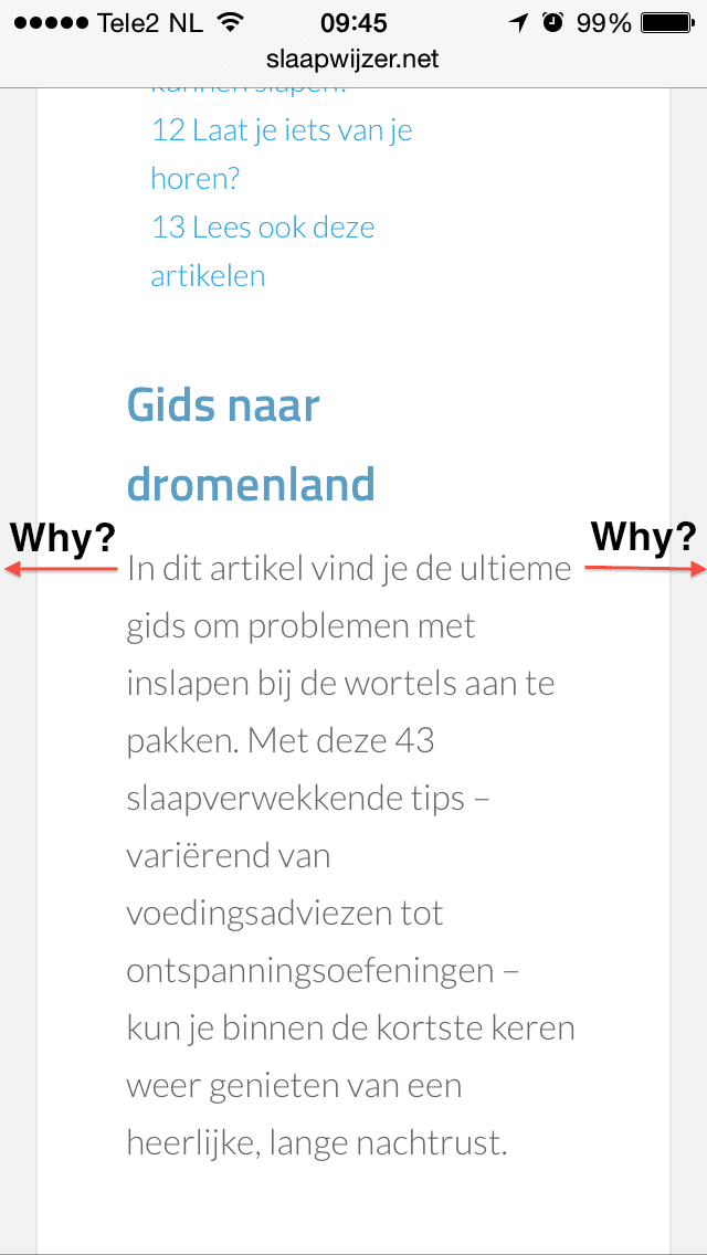
    Since yesterday I'm using the Enterprise theme for my Dutch website about sleeping problems. I really like the desktop version, but I'm not happy with the version that is shown on my Iphone. I have many long articles on my site and I do'nt understand why the text is so 'narrow'. A smartphone screen is not wide, so I don't think it's convenient for my readers to cut off some extra piece of the left and the right side. Besides, it doesn't look good.

    So my question is how I can display the text on (nearly) the full width of a smartphone screen, so it looks better and it's more convenient for my readers (less scrolling)? Note: I have little technical knowledge 🙁

    Problem (Enterprise theme on mobile display): http://slaapwijzer.net/wp-content/uploads/2015/04/fotoenterprise.png
    Preferred situation: Balance theme and all other mobile sites I visit: http://slaapwijzer.net/wp-content/uploads/2015/04/foto.png

    Thanks a lot in advance!

    William

    http://slaapwijzer.net
    April 5, 2015 at 8:37 am #146731
    Christoph
    Member

    Hi,

    you will have to add/change some things in the style.css

    Around line 2093 you will find @media only screen and (max-width: 768px) {

    To start replace

    .wrap {
    	padding-left: 5%;
    	padding-right: 5%;
    }

    with this and see how you like it.

    .wrap {
    	padding-left: 0;
    	padding-right: 0;
    }
    
    .featured-content .entry-content {
            padding: 10px;
    }
    
    .entry {
    	padding: 10px;
    }

    https://www.christophherr.com | Genesis Customizations | Buy me a coffee

    April 5, 2015 at 10:28 am #146741
    klaauw83
    Member

    Thanks Cristoph! The problem is solved 🙂

  • Author
    Posts
Viewing 3 posts - 1 through 3 (of 3 total)
  • The forum ‘General Discussion’ is closed to new topics and replies.

CTA

Ready to get started? Create a site or shop for themes.

Create a site with WP EngineShop for Themes

Footer

StudioPress

© 2026 WPEngine, Inc.

Products
  • Create a Site with WP Engine
  • Shop for Themes
  • Theme Features
  • Get Started
  • Showcase
Company
  • Brand Assets
  • Terms of Service
  • Accptable Usse Policy
  • Privacy Policy
  • Refund Policy
  • Contact Us
Community
  • Find Developers
  • Forums
  • Facebook Group
  • #GenesisWP
  • Showcase
Resources
  • StudioPress Blog
  • Help & Documentation
  • FAQs
  • Code Snippets
  • Affiliates
Connect
  • StudioPress Live
  • StudioPress FM
  • Facebook
  • Twitter
  • Dribbble