Community Forums › Forums › Archived Forums › Design Tips and Tricks › Modern Studio- how to change header image size
Tagged: header, Logo, modern portfolio
- This topic has 14 replies, 6 voices, and was last updated 8 years, 4 months ago by
JodieWTS.
-
AuthorPosts
-
May 31, 2015 at 2:28 pm #154300
alicehainsworth
MemberHi
I didn't realise my theme has a restricted image size (300x300) for the header image.... my logo is not square and so this is a problem. Currently the default image is what is showing on the page- I wonder how altering the size might affect the lines on the header....How do I change this?
Thanks
Alice
http://www.brilliant-day.co.ukMay 31, 2015 at 5:09 pm #154304James
ParticipantHi Alice
the header in modern studio is quite restricted, there is not a lot of room there for a larger logo, it is the style of the theme.
what size is your logo?
August 20, 2015 at 3:34 pm #163047philraymond
MemberThis worked for me with a logo that was 300 wide by 87 high. Adjust accordingly:
.title-area {height: 111px; width: 300px; }
.header-image .site-title > a {background-size: 300px 87px !important; height: 87px; }
@media only screen and (min-width: 930px) { .header-image .site-title > a {width: 300px; } }
.site-title {width: 300px; }
.site-title a {max-width: 300px; }
And change the theme's functions.php to point at your logo:
'default-image' => get_stylesheet_directory_uri() . '/images/logo.jpg',Or otherwise make your logo a png, name it 'logo.png' and upload it to the theme's image directory.
September 15, 2015 at 8:45 am #165578mooinzicht
MemberI have the same problem with my Logo http://www.mooinzicht.nl/wordpress the actual size is 450 x 215 How can I adjust this size into the design of Modern Studio?
I hope somebody can help me.
Thanks in advance
Kind regards,
MoniqueSeptember 15, 2015 at 3:25 pm #165631Tom
Participantthe header in modern studio is quite restricted, there is not a lot of room there for a larger logo, it is the style of the theme.
Jamie quite nailed it with this statement. This theme is not designed for large logo images - they just get in the way. (I would find another design solution.)
The mods detailed below are not 100% perfect, but should do the job for @mooinzicht. There are restrictions, however.
Left and right menus can have two items each at most. Even then the logo obscures portions of the menu at certain widths. If your menu title words are larger this will be worse.In functions.php, change the width and height values as shown:
//* Add support for custom header
add_theme_support( 'custom-header', array(
	'default-image'   => get_stylesheet_directory_uri() . '/images/logo.png',
	'width'           => 450, 	// was 300,
	'height'          => 215,	// was 300,
	'flex-width'      => false,
	'flex-height'     => false,
	'header-selector' => '.site-title a',
	'header-text'     => false,
) );
In the child theme stylesheet, replace the entire "Title Area" section with this code:
/* Title Area
--------------------------------------------- */

.title-area {
	display: inline-block;
	height: 215px;
	margin-left: auto;
	margin-right: auto;
	width: 450px;
	padding: 0 0px;
}

.site-title {
	background: #fff url(images/logo-circle.png) no-repeat;
	background-size: 450px 215px;
	float: left;
	font-family: Montserrat,sans-serif;
	font-size: 20px;
	font-weight: 400;
	height: 215px;
	letter-spacing: 1px;
	line-height: 215px;
	margin-bottom: 0;
	text-align: center;
	text-transform: uppercase;
	width: 450px;
}

.site-title a,
.site-title a:hover {
	box-sizing: content-box;
	color: #fff;
	display: inline-block;
	line-height: normal;
	max-width: 450px;
	padding: 15px 15px 20px;
	vertical-align: middle;
	word-wrap: break-word;
}

.header-image .site-title > a {
	background-color: #fff !important;
	background-position: center center !important;
	background-size: 450px 215px !important;
	float: left;
	height: 215px;
	width: 100%;
}

.site-description,
.site-title {
	margin-bottom: 0;
}

.header-image .site-title,
.site-description {
	background-image: none;
	display: block;
	height: 0;
	text-indent: -9999px;
}
In the media query for 930px, use this for navigation-container:
@media only screen and (min-width: 930px) {

	.navigation-container {
		background-color: #fff;
		border-bottom: 1px solid #000;
		border-top: 1px solid #000;
		margin-bottom: 98px;
		margin-top: -175px;
		min-height: 70px;
	}

}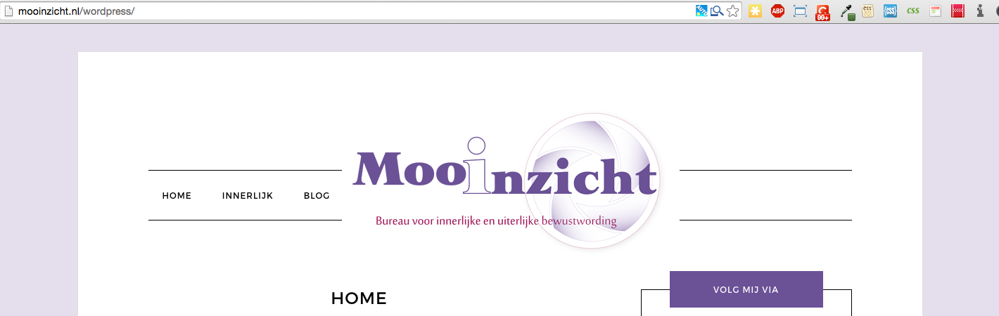
Choose your next site design from over 350 Genesis themes.
[ Follow me: Twitter ] [ Follow Themes: Twitter ] [ My Favourite Webhost ]September 16, 2015 at 1:19 am #165695MemberI made all the changes and I replaced the logo in my media folder. But the logo isn't like it should be.
What did I miss?
September 16, 2015 at 2:38 am #165713MemberDid I miss something in the changes of the size of the themplate itselfe? When I go to the customise menu and then to the header, then the system gives the right sizes which the logo must have. 450 x 215
September 16, 2015 at 2:49 am #165715MemberNow the whole layout of my website is too wide??
September 16, 2015 at 12:00 pm #165796ParticipantSome of your CSS changes are misplaced; also, I could have been clearer on the second CSS snippet. You'll have to restart from a backup or correct the changes*.
In the media query at 930 px, you've replaced the
.site-containerdeclaration with the snippet for.navigation-container, also breaking the media query with an extra "}". To be clear, the snippet replaces the matching code only within the 930px media query.This additional snippet should also replace the matching snippet in the 930px media query at line 1817, changing the width declaration to 450px.
	.header-image .site-title > a {
		width: 450px;
	}
This should help others that may be following along; *for your site, you can use this stylesheet edited from your site, preserving your color changes, etc. (remember to make backups before making changes): http://pastebin.com/nfcW1afe
Choose your next site design from over 350 Genesis themes.
[ Follow me: Twitter ] [ Follow Themes: Twitter ] [ My Favourite Webhost ]September 16, 2015 at 12:42 pm #165797MemberHello Tom,
Thank you very much for your help. It works. I noticed that the logo is to big when you visit the website on a mobile screen. Do you know what the standard minimal size is which works for mobiles ?
If you know this, is that easy for me change in the style.css? Before I make anothter mistake 😉
I hope you can help me with this final touch to get the logo 100%
Thank you in advance,
Kind regards,
MoniqueSeptember 16, 2015 at 2:18 pm #165801ParticipantHi Monique,
the logo is to big when you visit the website on a mobile screen
This is pretty common - the logo is a brand signal, not the main content of the page. It doesn't need to be really large, just recognizable -- and memorable 🙂what the standard minimal size is which works for mobiles
To support 'older' mobiles such as iPhone 4 and Samsung G3, up to 320px wide for the device/display (i.e. including margins and padding. Ref: https://css-tricks.com/snippets/css/media-queries-for-standard-devices/change in the style.css
Once you've determined your new logo size, the CSS changes are for height and width only, essentially replacing the old '450' and '215' values for the new ones. Some additional changes might be required because the new-size logo will sit differently in the header.
Choose your next site design from over 350 Genesis themes.
[ Follow me: Twitter ] [ Follow Themes: Twitter ] [ My Favourite Webhost ]September 18, 2015 at 1:33 am #165970MemberThank you very much everybody for your help & support. It worked, even the size for the mobie device is correct now.
Greetz,
MoniqueSeptember 18, 2015 at 12:32 pm #166025ParticipantHey, Monique,
Glad that worked out for you. Have fun with your site redesign!
Choose your next site design from over 350 Genesis themes.
[ Follow me: Twitter ] [ Follow Themes: Twitter ] [ My Favourite Webhost ]December 15, 2015 at 9:18 pm #173879JodieWTS
MemberHi,
I have this same problem. I have read through the above and implemented most of it, some doesn't seem relevant. I'm posting this here instead of in a new post as it's all connected.I have an image that is 1500px, height 954px. It resized nicely to width 236px, height to 150px and I have changed the code, as shown below.
Without a header image selected it shows the black circle, stretched to the size and centred with the Title Text.
With a header image added it crops and resizes fine but displays square (cropping left and right) and 'floats' the image left, making the right menu longer
I have used Firebug to try the source but I am as yet not an expert.
The website is ingridandmalcolm.com.au/preview if you would like to look
I looked at the @media code in CSS but it is the same as what is shown above. I read and understand code but haven't done specific training in CSS or PHP so don't know exactly what code to use to fix the problem.
I have made the following changes to functions.php and style.css… Is there some other changes I need to make?
Please help me
FUNCTIONS.PHP
//* Add support for custom header
add_theme_support( 'custom-header', array(
'default-image' => get_stylesheet_directory_uri() . '/images/logo.png',
'width' => 236, // was 300
'height' => 150,
'flex-width' => false,
'flex-height' => false,
'header-selector' => '.site-title a',
'header-text' => false,
) );STYLE.CSS
/* Title Area
--------------------------------------------- */.title-area {
display: inline-block;
height: 150px; /* was 150px*/
margin-left: auto;
margin-right: auto;
width: 236px; /* was 150px */
padding: 0 0px;
}.site-title {
background: #fff url(images/logo-circle.png) no-repeat;
background-size: 236px 150px; /* was 150px 150px*/
float: left;
font-family: Montserrat,sans-serif;
font-size: 20px;
font-weight: 400;
height: 150px; /* was 150px*/
letter-spacing: 1px;
line-height: 150px; /* was 150px*/
margin-bottom: 0;
text-align: center;
text-transform: uppercase;
width: 236px; /* was 150px*/
}.site-title a,
.site-title a:hover {
box-sizing: border-box;
color: #fff;
display: inline-block;
line-height: normal;
max-width: 236px; /* was 150px*/
padding: 15px 15px 20px;
vertical-align: middle;
word-wrap: break-word;
}.header-image .site-title > a {
background-color: #fff !important;
background-position: center center !important;
background-size: 236px 150px !important; /* was 150px 150px*/
float: left;
height: 150px; /* was 150px*/
width: 236px; /* was 100%*/
}.site-description,
.site-title {
margin-bottom: 0;
}.header-image .site-title,
.site-description {
background-image: none;
display: block;
height: 0;
text-indent: -9999px;
}December 15, 2015 at 9:44 pm #173884MemberI found the piece of code I needed... Just needed to look at Firebug better
For others - it was under the @media
.header-image .site-title > a {
width: 236px; /* was 150px*/
}I recommend doing a search in the CSS for .header-image and look for anything to do with size. I just opened it in notepad++
-
AuthorPosts
- The forum ‘Design Tips and Tricks’ is closed to new topics and replies.