Community Forums › Forums › Archived Forums › General Discussion › Fabric8ted 1.0 and iPhone
- This topic has 10 replies, 5 voices, and was last updated 10 years, 7 months ago by
Anita.
-
AuthorPosts
-
September 21, 2013 at 3:31 pm #63695
Mary OBrien
MemberHey all,
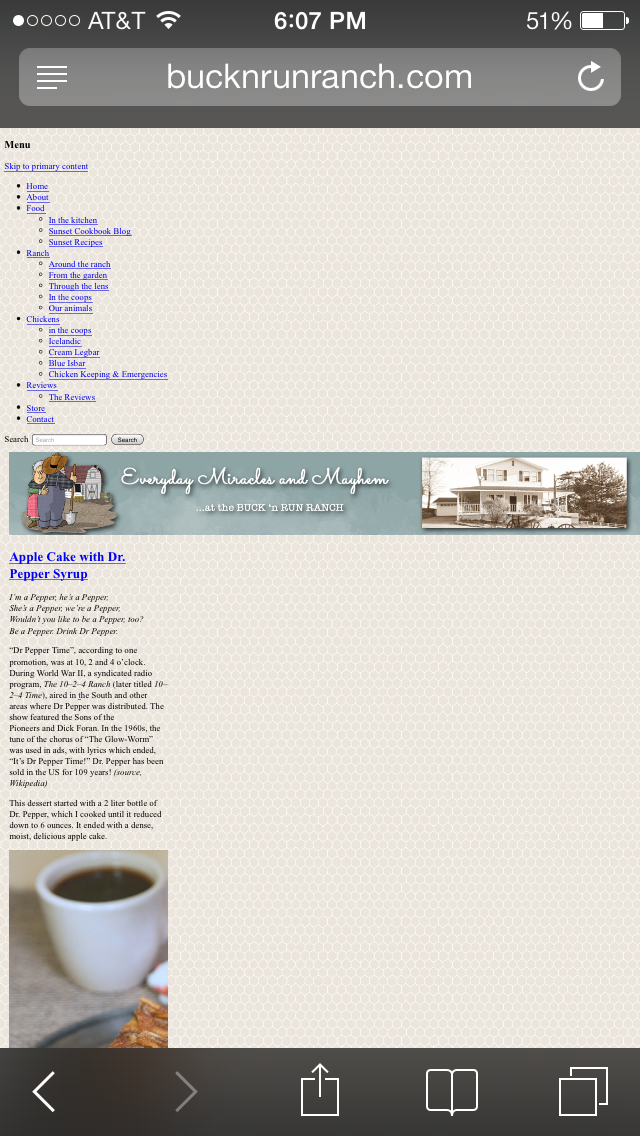
I noticed sometime after upgrading to Genesis 2.01 that the website ( http://www.bucknrunranch.com ) does not appear correctly on the iphone (3 and 5 using IOS 6 and 7) safari browser. All items except header are scrunched to the left side.
This does not happen, however, on the iPad (4th generation) so IOS 6 and 7 might be able to be ruled out. (which stumps me)
I have upgraded all code to HTML5 which did not fix the problem
Any ideas?
Thanks,
http://www.bucknrunranch.com
MarySeptember 21, 2013 at 5:39 pm #63704Susan
ModeratorMary - I don't have any suggestions for you, but it looks normal on my iPhone 5, using ios6
September 21, 2013 at 6:50 pm #63707Anita
KeymasterMary, can you provide a screen shot of what you are seeing. That would help a lot.
Love coffee, chocolate and my Bella!
September 21, 2013 at 6:54 pm #63708emasai
ParticipantCan't help either but it looks bad on my iPhone5 on os6 and on my ipad 2 or 3 also running os6. It looks like the media queries are not being picked up.
Need Website Customization or a Responsive CSS fix? Contact Me
Lynne emasai.comSeptember 21, 2013 at 7:14 pm #63709MemberHere is a photo of what I see http://dancemad.ipower.com/images/photo.PNG
September 21, 2013 at 7:32 pm #63711KeymasterMary, I am seeing the same thing on my Android phone but not on my Kindle Fire. By any chance did you add a plugin for a mobile menu or is that the new menu Jessica from the Pixelista.com added in there? Or possibly... do you have the Mobile version activated in the Jetpack? If you didn't add the plugin or mobile version activated, you should submit this directly over on Jessica's website under support.
Love coffee, chocolate and my Bella!
September 21, 2013 at 7:33 pm #63712KeymasterNow that I look at the footer - I think Mobile web is activated in Jetpack - deactivate that.
Love coffee, chocolate and my Bella!
September 21, 2013 at 7:47 pm #63716MemberFound it .... and that worked.....thanks so much Anitac
September 21, 2013 at 7:49 pm #63717KeymasterGo to Mobile Theme under Jetpack - click Deactivate. You should see a Blue Activate or Deactivate on there.
Love coffee, chocolate and my Bella!
September 21, 2013 at 8:00 pm #63720Bill Murray
Member@Mary OBrien - Here are some suggestions/comments:
1) You do have issues with mobile responsive design, but not quite what you're described. Mobile responsive design is tied to screen width, not the device's OS, so that's why something can work on an iPad but appear broken on an iPhone using the same OS or browser version. Those devices have different screen widths.
2) Your site doesn't appear to be running HTML5.
3) Don't worry about iOS versions or devices just yet. Simply drag your browser to a set width for basic testing. If you drag your browser to a narrow width, you will see that your header is too wide for an iPhone. Other elements look good.
4) Once you have your basic responsive design working, then you can begin looking at the site on different devices.For #3, there are different ways to simulate the specific width of a device, depending on your browser. In Google Chrome, you can hit F12 to bring up developer tools. In the lower right, you'll see a gear icon for settings. Click it. Click the Overrides menu selection, and choose your device or browser overrides. Be sure to enable them so that they show up. This allows you to navigate your site using Google chrome and appearing to be a device (or another browser). You'd explore your site using this tool and adjust your mobile responsive CSS as necessary to fix the problems you discover. There are other tools for other browsers.
How to fix everything that you don't like is a separate discussion, but that should point you in the right direction to identifying where the problems are.
Hope that helps.
Web: https://wpperform.com or Twitter: @wpperform
We do managed WordPress hosting.
September 21, 2013 at 8:11 pm #63722KeymasterYou're welcome Mary!
Love coffee, chocolate and my Bella!
-
AuthorPosts
- The topic ‘Fabric8ted 1.0 and iPhone’ is closed to new replies.