-
Search Results
-
Topic: Pretty Young Theme Width
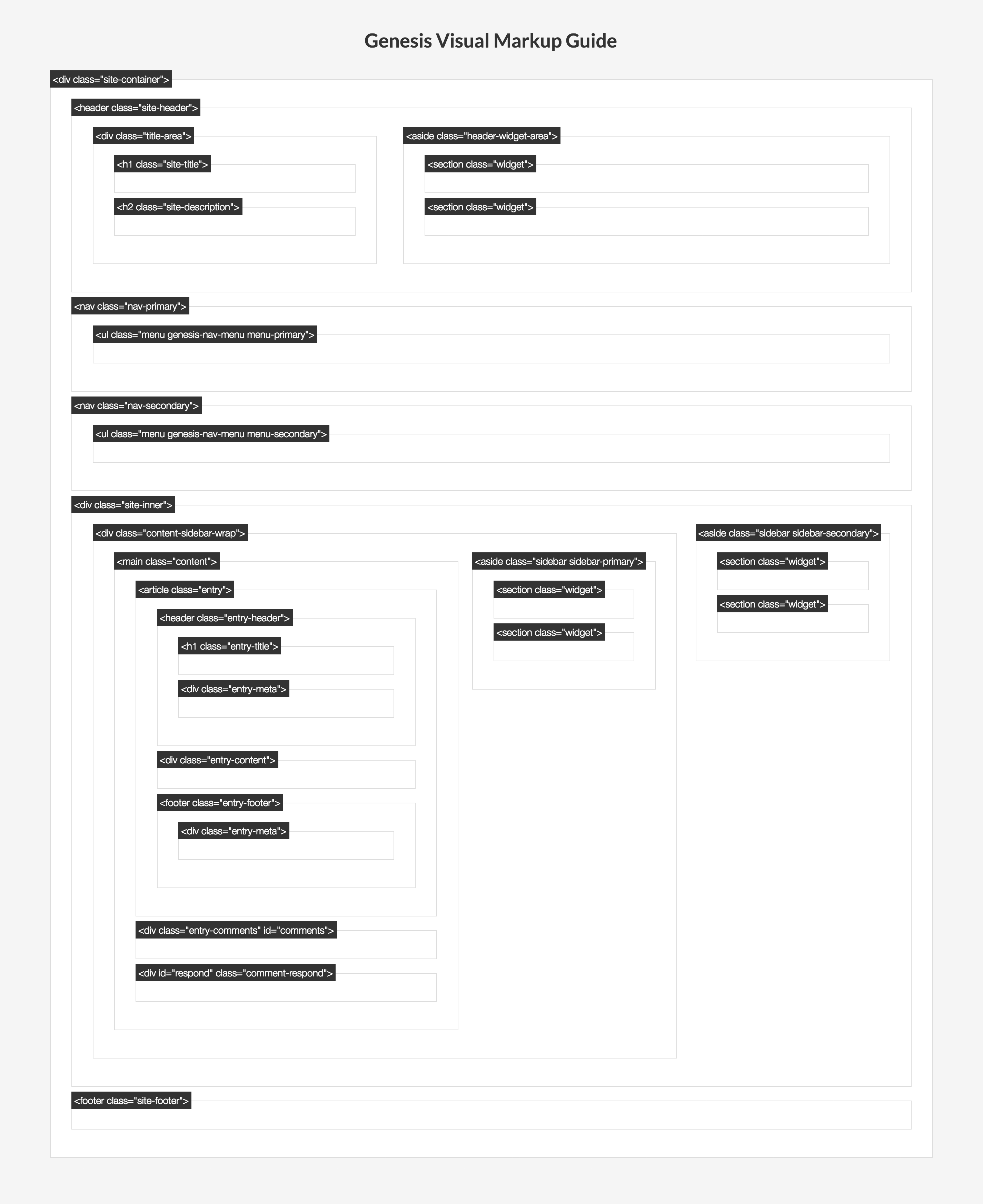
I recently purchased Genesis and am trying to customize the PYT theme. I currently have content sidebar sidebar layout. I figured out how to adjust the widths of the sidebars, but I would also like to adjust the content width. I am guessing I will need to increase the entire page width to accommodate what I need. Also, I need to add spacing, everything is very smushed.www.theuncoordinatedmommy.com
Please help!
I am trying to figure out how to make the content area larger, since I made the theme wider, and I have sidebar-content-sidebar, but whenever I make the content section larger it pushed the sidebar to the right off the page, and doesn't move to the left...any ideas?
thanks
site is
Topic: Metro – 3 Nagging Questions
Hi folks, I'm hoping someone can help me with a few Metro questions that I can't seem to find the answer to. Unfortunately the site is in development so I can't share the link, but any help would be most appreciated.
1. I want to position a 728x90 ad in the header to the right of a 270x90 logo. However, the header-right widget area is too small and cuts off the ad. I tried adjusting the #header and #widget-area properties in the theme's css but it had zero effect. Would someone be able to provide the exact code/adjustments needed to make the ad sit snugly to the right of the logo?
2. I'm also trying to position/wrap the post titles and post meta information on the homepage (not single page) to the right of the respective post thumbnails. Currently, they sit above the image, but I'd prefer them to be positioned like they are in the "Featured Bottom Widget" (i.e. to the right of the image and just above the excerpt), which I'm unable to use as our client requires the page navigation which disappears when using the content area widgets.
3. Finally, how can I adjust the width of the Metro theme? I'd like the main content area to be 650px and the sidebar 300px. Where in the code can I make this adjustment?
Thanks in advance for help with the above.
1. I use the Minimum theme and want to show the featured image on the home page.
2. When I set a featured image, it shows up as a thumbnail om the blog page, but in the post it shows in the header. Because of the sizing of photos, it looks dumb. How do I fix this design wise?
2. I want to adjust the width and length of the excerpt text and image ob both the home page and the blog posts page.
3. I want to change the text that says "From the Blog" on the blog post page.
Thanks.
Hi there,
thanks for reading this thread 🙂I'm looking for a full width layout for my blog posts.
But I want it to have a custom width and centered, including centering the post title (very important).I don't know if what I just wrote is clear enough 🙂
I basically want the text in my full width page to be let's say not wider than 3 inches
and centered so that the reader has an optimal reading experience.
(Ideally it would be great and amazing and marvelous if everything around my post content would fade out while my reader is reading and then maybe fade in again when he points the mouse around my post,
but maybe I'm asking too much and I would need to pay $1M to someone to do that 🙂 so let's go with the
simple custom centered width for today).Oh! Please don't take for granted I know about coding, because I don't 🙂
So in your answer please write also things that you would suppose I know, like if I'm your grandpa 🙂
(unless you are Bill Gates' grandson)
Thx
FabioTheme Eleven 40
Hi all!
I'm having a hard time trying to edit the image display on the blog page - with the going green demo the featured image is full page width above the title for the blog page. I would like to use the 150x150 thumbnail and have it align with the text instead of being above the title. Kinda like how the standard excerpt is - title, meta data, image aligned left to excerpt text.
I have not found any success in finding where this is set up so I can adjust it. Anyone have ideas on how to help?
The page is: http://www.venturewalk.com/category/general/
Any suggestion would be much appreciated!!!
Victoria
I am using the Executive Theme under Genesis. Working on XAMPP development site (not live yet). My goal is to make the first page lay out exactly like the Demo. Got the header and menu locked in so far, but the slider has been a problem. At first it looked okay except for the images being left justified under the caption area or so it seemed. After a lot of work get the CSS to be exactly like the demo CSS for the slider (using Firebug) I punted and deleted the images from the Portfolio where they were being selected by the slider. I started to reload larger ones 1040 X 445 and right justifying them. Still no go and in fact the height of the slider shrunk to about 15px. But the width is 100%.
What the heck is going on? I cannot get this adjusted at all The pictures are loading, because I can click on them and display those images. My home page is "latest posts" and not static. I have tried so many different combinations to find a clue, but nothing seems to budge the height. the CSS look right on. The arrows display okay too. But the height is collapses. Tried it on Firefox and IE. Same results. Thoughts?
Welcome!
These forums are for general discussion on WordPress and Genesis. Official support for StudioPress themes is offered exclusively at My StudioPress. Responses in this forum are not guaranteed. Please note that this forum will require a new username, separate from the one used for My.StudioPress.